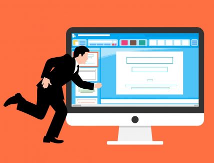
What’s the first feeling that the website produce for a user?
Imagine you’re a visitor. You come to a website. What’s the first feeling that the website produce for you?
You hate it and leave it.
You’re just OK with the page but you won’t go through other pages.
You love it and you don’t want to leave this website at all.
Let’s take a look at some major reasons why people hate or love a website.
First reason: Quality of content
You hate it:
You come to a website and you hate it.
You try to leave ASAP.
But Why?
Because the contents of the website is anything but what you need. They didn’t think of your experience at all.
It’s impossible to find the information you need. And it comes up by stress, anxiety and unpleasant feelings for you as visitor.
You’re just OK:
It produces when the content is exactly similar to others. There is nothing new on it.
For these types of websites you feel boring after visiting them.
You may think with yourself there is nothing new that make them different and unique. It’s like they suffer from lack of something.
Most of the time it’s because they don’t have a strategy and a specified tone for themselves.
You love it:
It produces when the content has a unique tone. It’s completely obvious that there is strategy behind this website.
They provide information that you need. The designers make it easy for you to find anything that you want.
Happy feelings produce when you find easily your needed information.
These kinds of websites usually load fast. Also their leading pages designed very well and you feel nice & fresh afterwards.
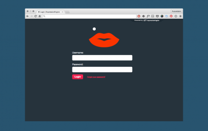
Second reason: Color
You hate it:
These websites don’t have the right color scheme. Their color combination is terrible.
Most of the colors on these websites are too bright or too dark and distract from the content.
When a website create bad feelings it means that the color combinations aren’t harmonious to the eyes of visitors.
You’re just OK:
Selecting colors for these websites comes up with coping from the others. They choose the simplest method.
So even if their color combinations is acceptable to the eyes but they’re not unique at all.
The most important problem with them is that their color schemes isn’t based on their strategy, branding, content and format of their websites.
You love it:
These websites truly know the significance of color to the human mind.
Their color creates ideas, express messages, spark interest and generate good feelings.
Choosing colors for these websites comes up by psychology of color.
They know how colors work together and how they are evaluated internally and emotionally.
For more information about color Psychology you can read this article by Nicole Martin’s Ferreira.
Third reason: Fonts or typography
You hate it:
Fonts seems over-complicated, cluttered and messy on these websites.
They don’t have any style of font for their body or headers.
They don’t pay attention to size and spacing of fonts on their website.
The worst thing about these websites comes up with terms of readability. As a visitor you can’t read their content easily. And it really sucks.
You’re just OK:
They choose the most famous fonts.
The fonts are readable but you don’t see any connection to the brand and business.
Size and spacing are OK but they may appear messy and slapdash on some pages.
The formatting on these websites is done normal.
You love it:
They express their brand personality with their fonts.
They know how to choose the right fonts for their brands. For choosing fonts, they think carefully to their Target audience.
Size and spacing are both integral factors for them.
Forexample if their brands is bold and brash, they choose large lettering for garbing people’s attention. On the other hand when they want to come across as being quiet and gentle, they use small lettering surrounded by white-space and it feels as little as though whispering.
They choose everything based on their brand personality and in a way that encourage people to lean in and listen carefully.


Tourism. Behavior. Neuromarketing.
The psychology of behavior in Tourism
Neuroscience. Link. Marketing.
Neuroscience marketing strategy
Mirror Neurons.Link.Web Design
The Role of Mirror Neurons in Web Design